Ever looked at a cryptocurrency chart and felt like you were staring at a chaotic heart monitor? You aren't alone. For a newcomer, the flashing red and green bars can look like a random mess, but they are actually a visual language. If you can speak it, you stop guessing and start making decisions based on data. Most traders aren't psychic; they just use crypto trading charts to spot patterns that repeat themselves over and over.
Reading these charts is the foundation of technical analysis. Whether you're eyeing Bitcoin or a small-cap altcoin, the goal is the same: figure out where the price has been, where it's likely going, and where the "danger zones" are. While it seems complex, you only need to master a few core concepts to go from confused to confident.
The Basics: Choosing Your Chart Type
Before you start analyzing, you need to pick the right lens. Not all charts are created equal, and using the wrong one can hide the very information you need. Line Charts is the simplest visualization, connecting only the closing prices of an asset over a specific time. They are great for seeing the big picture-like whether a coin is in a long-term uptrend-but they strip away the "noise" of what happened during the day. If you want to know if a price crashed and recovered quickly, a line chart won't show you that.
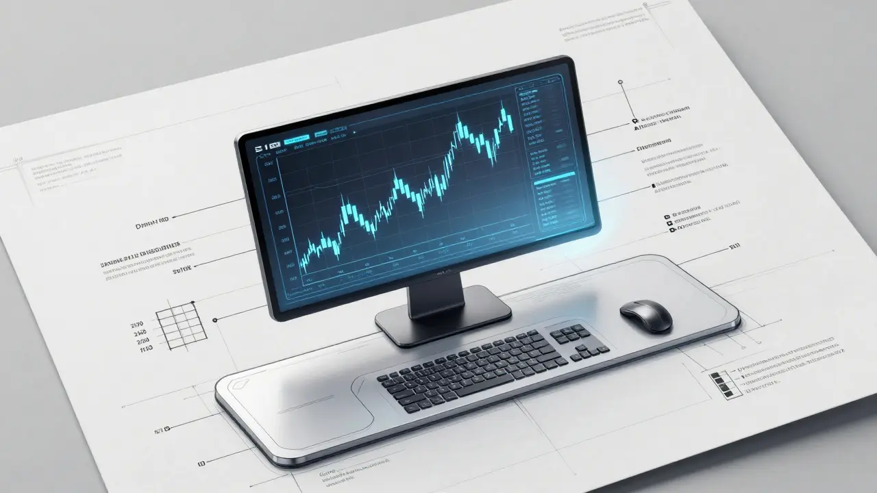
This is why most pros use Candlestick Charts. These charts provide four data points for every time interval: the open, close, high, and low prices. Each "candle" tells a story. A green candle means the price closed higher than it opened (bullish), while a red one means it closed lower (bearish). The thin lines sticking out of the top and bottom, called wicks or shadows, show you how far the price pushed before the market pushed back. If you see a long bottom wick, it's a sign that buyers stepped in to stop a crash, which is often a bullish signal.
| Chart Type | Best For | Key Advantage | Main Limitation |
|---|---|---|---|
| Line Chart | Beginners / Long-term trends | Clean, zero noise | Hides intra-day volatility |
| Candlestick | Active Trading / Pattern spotting | Rich price action detail | Can be overwhelming at first |
| Bar Chart | Old-school technical analysis | Shows full price range | Less visual clarity than candles |
Mastering Timeframes and Scales
One of the biggest mistakes beginners make is getting "timeframe paralysis." This happens when you stare at a 1-minute chart and panic because the price dropped 1%, ignoring the fact that on the daily chart, the asset is up 20%. To avoid this, always use a top-down approach. Start with the weekly or daily chart to find the general trend, then zoom into the 4-hour or 1-hour charts to find your specific entry point.
You also need to understand the difference between arithmetic and logarithmic scales. An arithmetic scale uses equal distances for equal price changes (e.g., the distance from \$10 to \$20 is the same as \$100 to \$110). However, in crypto, where a coin can go from \$1 to \$10,000, this makes the chart look like a flat line followed by a vertical wall. A Logarithmic Scale is a way of plotting data where equal percentage changes are shown as equal distances. If a coin goes from \$1 to \$2, that's a 100% increase. On a log scale, that same visual distance would represent a move from \$100 to \$200. For assets with exponential growth like Bitcoin, the log scale is almost always the better choice.
Spotting Patterns That Actually Work
Once you can read a candle, you can start looking for patterns. These aren't magic spells, but they show you where the psychological battle between buyers and sellers is happening. There are three main types of patterns to watch for:
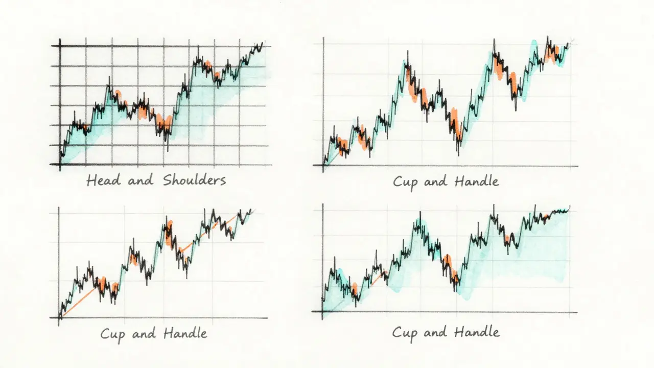
- Reversal Patterns: These tell you a trend is about to flip. The "Head and Shoulders" pattern is a classic example where a peak is followed by a higher peak, then another lower peak, signaling a move from bullish to bearish. The "Cup and Handle" is another favorite, often predicting a massive breakout after a period of consolidation.
- Continuation Patterns: These suggest the market is just taking a breather before continuing in the same direction. "Flags" and "Pennants" are small consolidations that usually lead to another leg up or down.
- Rhythmic/Harmonic Patterns: These are more advanced and use specific Fibonacci ratios to predict turning points. They are a bit more complex and usually require a dedicated tool to identify.
But here is the golden rule: never trust a pattern alone. If you see a bullish engulfing candle but the trading volume is dead, it's likely a fake-out. Volume is the fuel for the move. If the price is rising and the Volume-the amount of the asset traded in a given period-is also spiking, it means the move is real and supported by the market.
Using Tools Like TradingView
You don't need to draw these by hand. TradingView is the industry standard for crypto charting. It's a cloud-based platform that lets you overlay indicators, draw trend lines, and share charts with other traders. Most exchanges, like Coinbase or Binance, actually use TradingView's infrastructure for their own internal charts.
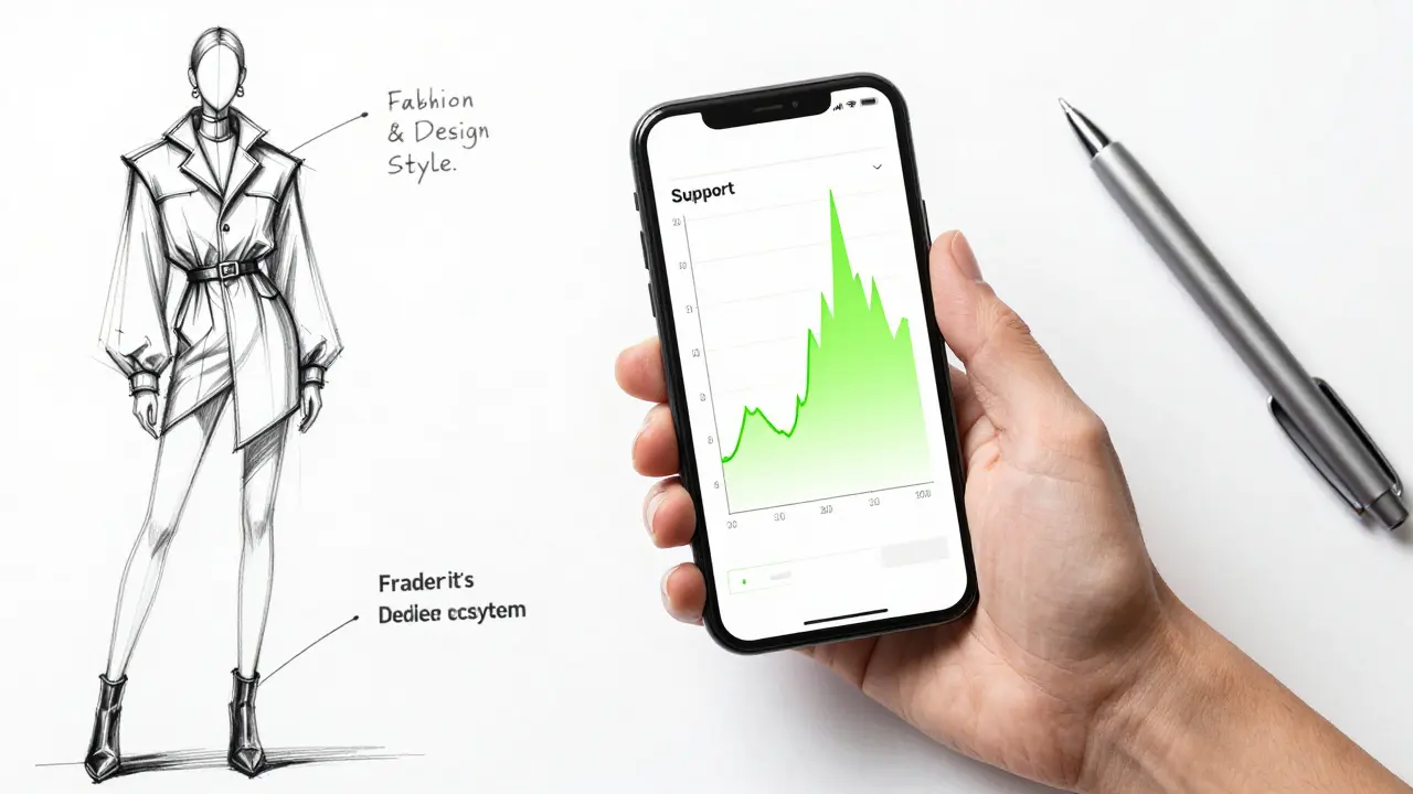
When using a platform like this, start with the basics. Use horizontal lines to mark Support and Resistance. Support is the "floor" where the price tends to stop falling because buyers think it's a bargain. Resistance is the "ceiling" where sellers start dumping because they think the price is too high. Trading between these two levels is where most of the action happens.
The 4-Phase Learning Path for New Traders
If you try to learn everything at once, you'll get overwhelmed and probably lose money. Instead, follow this structured approach to build your skills:
- Phase 1: Trend Identification. Spend 2-3 weeks only looking at daily charts. Don't add any indicators. Just ask: "Is the price generally going up, down, or sideways?"
- Phase 2: Candlestick Basics. Spend another month learning to identify individual candles (like Hammers or Dojis) and basic patterns. Try to spot them in real-time without jumping into a trade.
- Phase 3: Volume Analysis. Start looking at the bars at the bottom of your chart. Look for volume spikes that are significantly higher than the average. This tells you when the "big money" is moving.
- Phase 4: Multi-Timeframe Integration. This is the pro level. Learn to correlate a daily trend with a 4-hour momentum shift and a 15-minute entry signal. This is often called the 1h/4h/Daily triad.
Avoiding Common Charting Pitfalls
The biggest danger in charting is "seeing what you want to see." This is called confirmation bias. If you're desperate for Bitcoin to hit \$100k, you'll start seeing bullish flags everywhere, even when the data says otherwise. To fight this, always look for reasons why your trade might fail before looking for reasons why it will work.
Another trap is overcomplicating your screen. Beginners often add five different indicators-RSI, MACD, Bollinger Bands, EMAs, and Stochastic oscillators-until they can't even see the price. This is called "analysis paralysis." Most professional traders keep their charts clean. If the price action and volume are clear, you don't need a rainbow of lines to tell you what's happening.
What is the best timeframe for a beginner to use?
Start with the Daily (1D) chart. It filters out the random noise and volatility of shorter timeframes, making it much easier to see the actual trend. Once you are comfortable, move to the 4-hour (4H) chart for more detail.
Does a green candle always mean the price is going up?
A green candle simply means the closing price was higher than the opening price for that specific time block. It doesn't guarantee the price will continue to rise. In fact, a very large green candle at the end of a long rally can sometimes be a "blow-off top," signaling that the move is almost over.
Why should I use a log scale instead of an arithmetic scale?
Crypto assets often move in percentages rather than fixed dollar amounts. An arithmetic scale makes a move from \$1 to \$10 look tiny compared to a move from \$10,000 to \$10,010, even though the first move was a 900% gain. A log scale keeps percentage changes visually consistent, which is essential for long-term analysis.
What is a "fake-out" in crypto charting?
A fake-out (or bull/bear trap) happens when the price breaks above a resistance level or below a support level, making it look like a new trend is starting, only to immediately reverse. You can often spot these by checking the volume; a true breakout usually happens with a significant surge in trading volume.
Is TradingView free to use?
Yes, TradingView offers a robust free tier that is plenty for beginners. It allows you to use a limited number of indicators and a few charts. As you grow into a professional trader, you may want to pay for a subscription to get more indicators, faster data alerts, and more chart layouts.
Next Steps for Your Charting Journey
If you're just starting, don't put your real money on the line yet. Use a "paper trading" account-a simulator that lets you trade with fake money using real-time price data. Try to predict the next move based on a pattern you've learned, and then see if it actually happens.
If you find yourself struggling with a specific pattern, join a community like a dedicated Discord or Reddit group to get a second opinion on your charts. The goal isn't to be 100% right (which is impossible), but to be right more often than you are wrong. Keep your charts clean, stick to your timeframes, and always check the volume before you click buy.


